Redesigning Cabana’s Booking Flow
My Role
I designed the entire experience for the booking flow, and conducted usability testing along with the team’s Product Manager.
About Cabana
Cabana is a Seattle-based startup in the travel and mobility space. They rent out ‘mobile hotels’: camper-vans upfitted for a hotel-like experience.
The Project
Improving Cabana’s booking flow
In order to get the product out at launch, we decided to use an iframe from a third party site for booking. This was a good short-term solution, but it had serious drawbacks. I worked with the product & engineering teams to design a better booking flow for the Cabana website.
The newly designed booking flow launched in February 2021.
Before
After
Identifying the Problems
1. Availability
During Covid, RV and camper-van rentals skyrocketed as restrictions on air travel increased. Cabana didn’t have enough vans to meet the huge demand for rentals. With that came the difficulty of finding availability. Users became frustrated when they would enter dates and repeatedly come up with no results. The existing experience did have a solution to this problem - a calendar showing every single van’s availability, but even with 10 vans this calendar was difficult to sort through. With more vans, it would become nearly impossible to decipher.
2. List View
Booking required users to select from a list of every Cabana van, even though each van is identical. Not only did this cause confusion because users could not determine the difference between the vans (there was none), it would also become unmanageable as Cabana expanded. While there were just 15 vans now, there would soon be 30, then 100, then some day, 1000, all across different cities.
3. Un-digestible Details
Because we were using an iframe, we had no control over the experience. The existing experience showed users a lot of textual information, forcing users had to sift through paragraphs of text about the product, and we saw users struggle to parse the information when we conducted preliminary usability testing.
Designing Solutions
1. Eliminating the List
Usability testing had shown us that the choosing from a list of identical vans was confusing and caused users to pause.
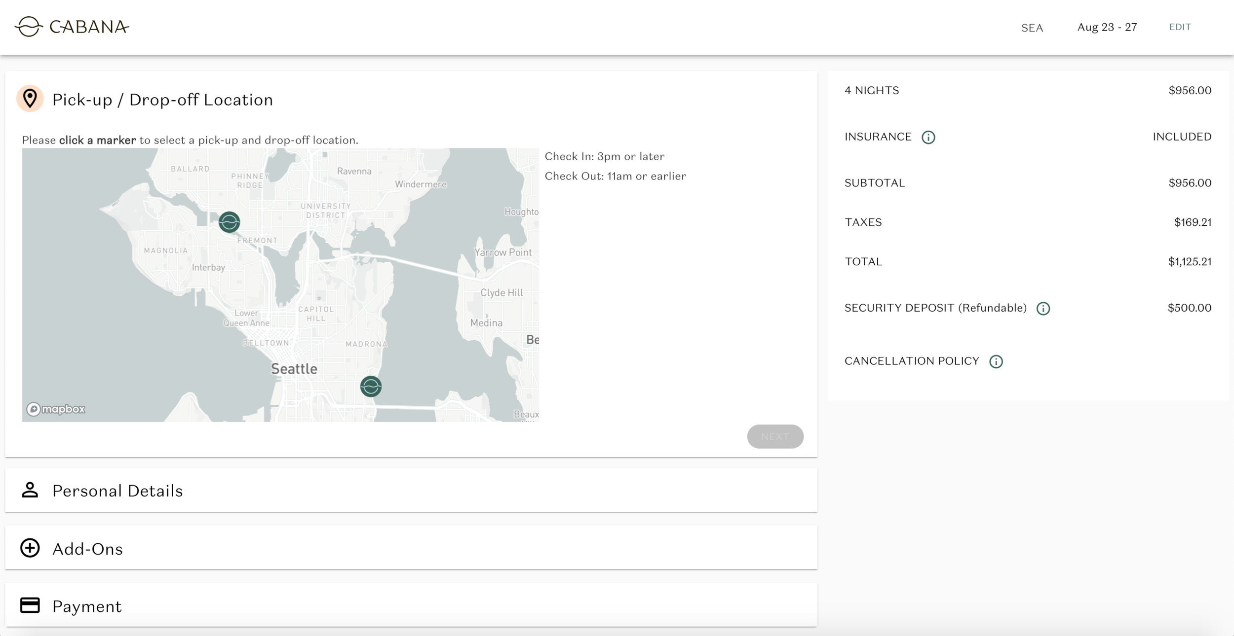
What we were really trying to get was a pick-up location (the location where they pick up their van). Each van in the list, though identical, was located at a different address. They were spread across different cities (Seattle & LA), and parked at different spots within each city. So instead of having users choose a van at random, and later find out its address, we wanted to assign a van to a user based on their ideal pick-up location.
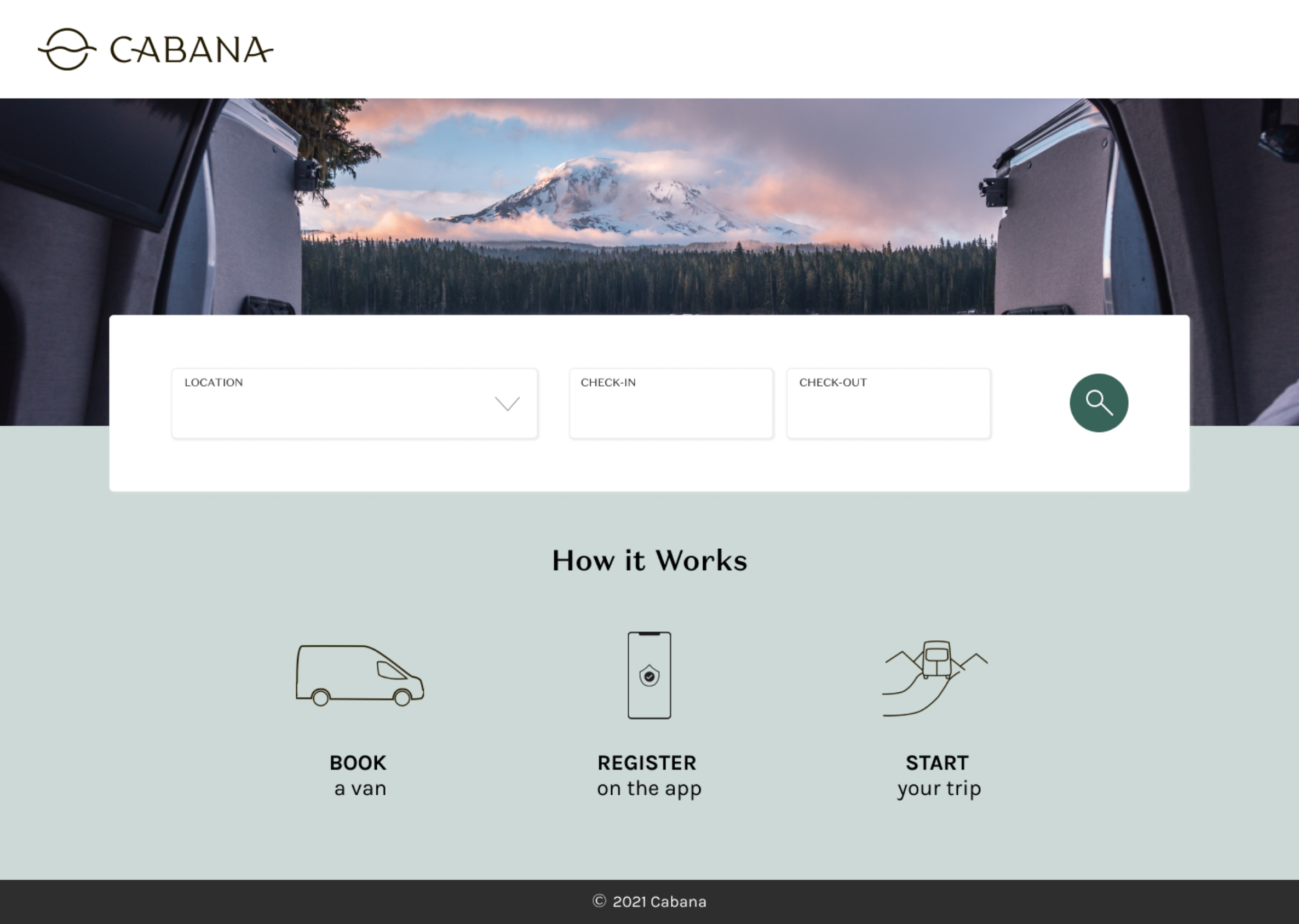
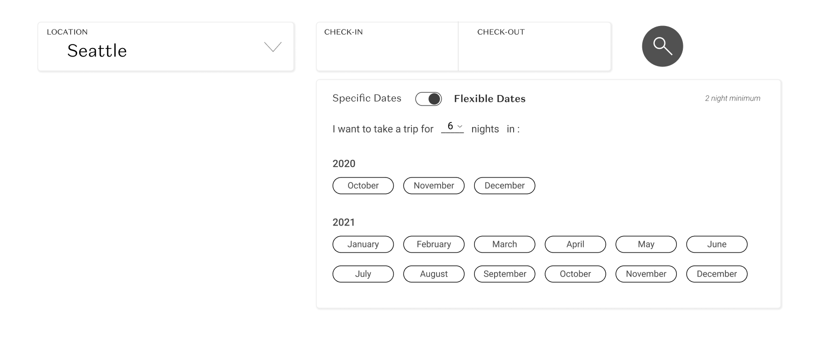
First, we asked users to select a city (LA or Seattle at this point).
Then, after choosing their dates, we asked users to choose a pick-up location from various Cabana locations on a map. They could choose the location that was most convenient for them.
Once a spot was chosen, we could assign a specific van to the user’s booking. We would know which van they were receiving, but to a user, it didn’t matter which van. All they needed to know was that they would get a van.
2. Addressing Availability
We knew from customer feedback and usability testing that one of the largest issues users faced was finding van availability. While we were producing vans quickly, we needed to come up with a solution to address this issue in the booking process.
After doing a competitive analysis, I came up with the idea of ‘flexible dates’, where a user with a flexible timeline could select a month or multiple months in which they wanted to take a trip, and choose an approximate number of days for that trip. We would then present them with a number of available date ranges, thereby giving them flexible options, and ensuring they wouldn’t have to repeatedly try dates until they eventually gave up.
I came up with another (fairly common) solution - if a user enters dates in which there was no van availability, we could present alternate dates around the same time, with a similar duration. In this solution, even if a user could not find availability at first, they would not be left hanging.
Final Solution
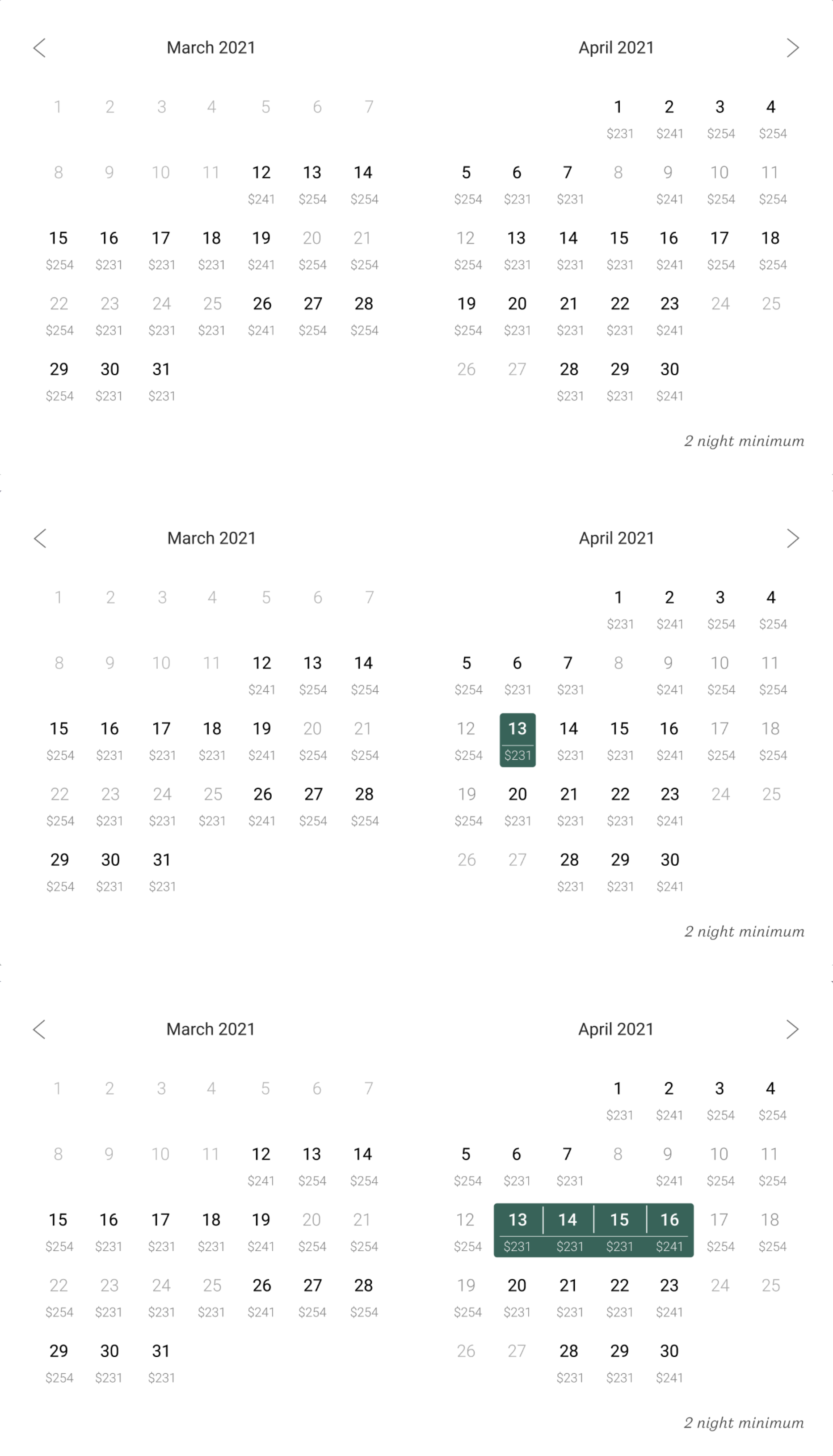
We ended up with this solution, based on the calendar of another hotel booking site.
Initially, on days in which there are no vans available, the dates are greyed out.
When a user clicks on one date, they can see the longest period of time that one van is available.
This solution solved a big problem:
For example, if a van is available from April 13-16, and another van is available from April 17-19, a normal calendar would show availability from April 13-19. With this solution, available dates are only shown based on specific vans’ availability.
3. Providing Digestible Details
Many Cabana users have never stayed in an RV or camper van before, so for most, this was completely new experience. When trying something new, people often want more information, especially when investing a lot of money on this new experience. The existing booking flow did provide users with information, but it was in the form of heavy text. We needed a way to give users a lot of information without needing to read too much.
We did this in a couple of ways.
First, I designed a screen with icons that represented the van’s amenities, rather than explaining it all in text. Additionally, in user interviews, I had found that users actively looked for ‘functional’ information - cancellation policy, insurance information, and pricing.
I decided to include this information early and often. As soon as the city and dates were selected, users could see pricing, cancellation, and insurance information. And afterwards, they could see all of that in the module on the right side, no matter where they were in the booking process.
On the next screen, we continue to share information about insurance, security deposit, cancellation policy, and pricing on the right side of the screen.
On the last screen, I wanted to make sure we showed a quick overview of the user’s booking, as well as resources moving forward. The goal was to make them feel as prepared as possible for the trip ahead.
Looking Back
The new booking flow launched in February 2021. At this point, it’s too early to see the impact, but we will continue to track interaction with Google Analytics and Hotjar.
Throughout the design and development process, I worked with various teams at Cabana, including the Operations, Marketing, and Engineering teams. I learned a lot about balancing needs from different teams, and especially working within and adapting to technical constraints once development began. We had to make some sacrifices in order to get the MVP out, but I’m excited to keep iterating on the designs as we gather more user feedback, and form new goals as a company.


